All business finances, in one app
Qonto is a fintech company revolutionizing business banking, and design has been pivotal in its growth. The innovative and user-centric design approach has created a seamless and visually appealing banking platform that simplifies financial management for businesses.
We had the privilege to work on various critical projects that significantly contributed to enhancing the user experience and the overall success of the company. Our work was driven by a dedication to user-centered design principles, aiming to create a seamless, visually appealing, and efficient platform for businesses to manage their finances.
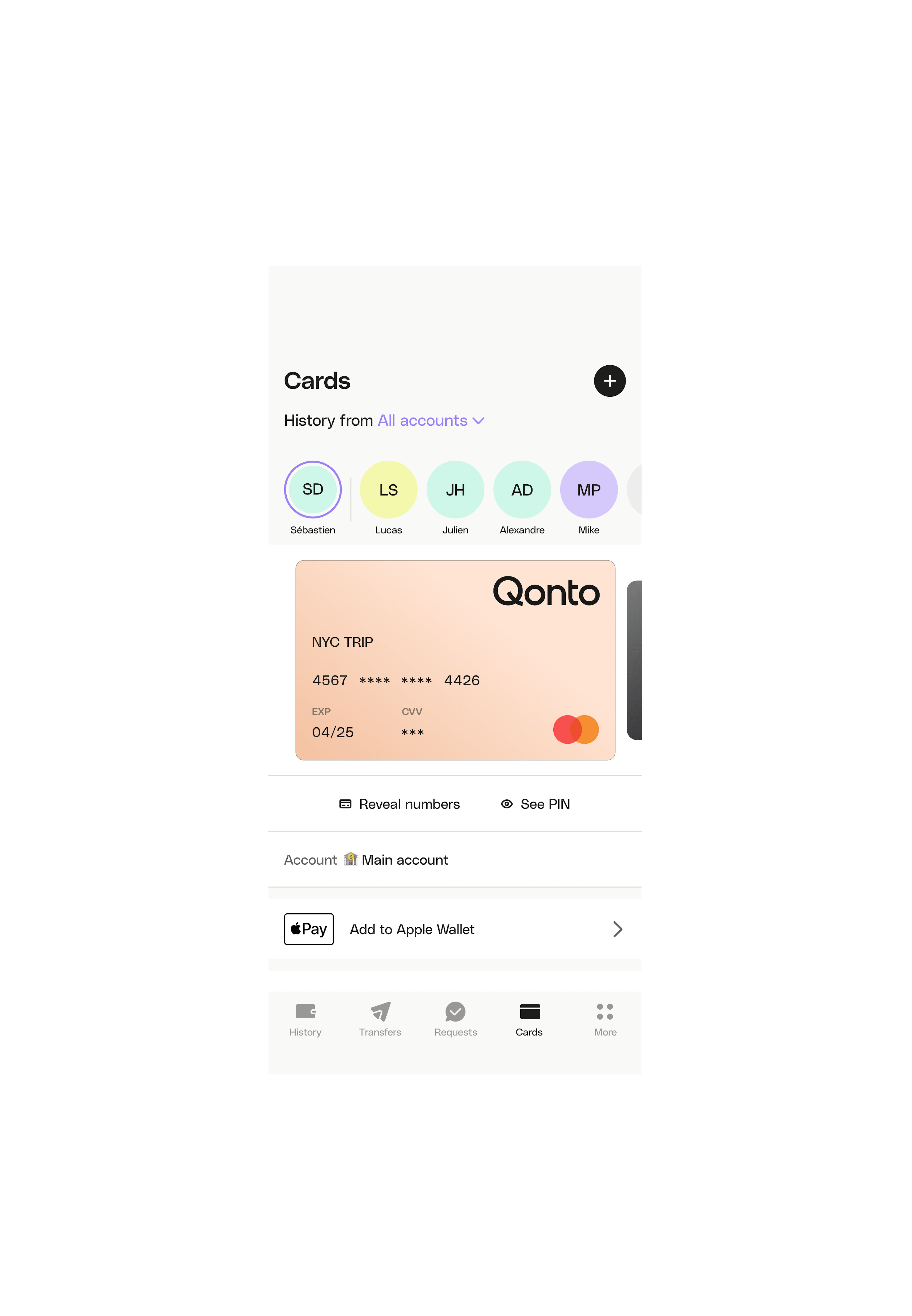

Cards management
We designed best-in-class services to reduce user friction and improve the card management experience. This involved creating an intuitive and user-friendly interface for users to order, activate, and manage their business cards.
We added Apple Pay and Google Pay enrollments and the possibility to view the PIN code in-app. Those improvements led to a 20% decrease card related support tickets.
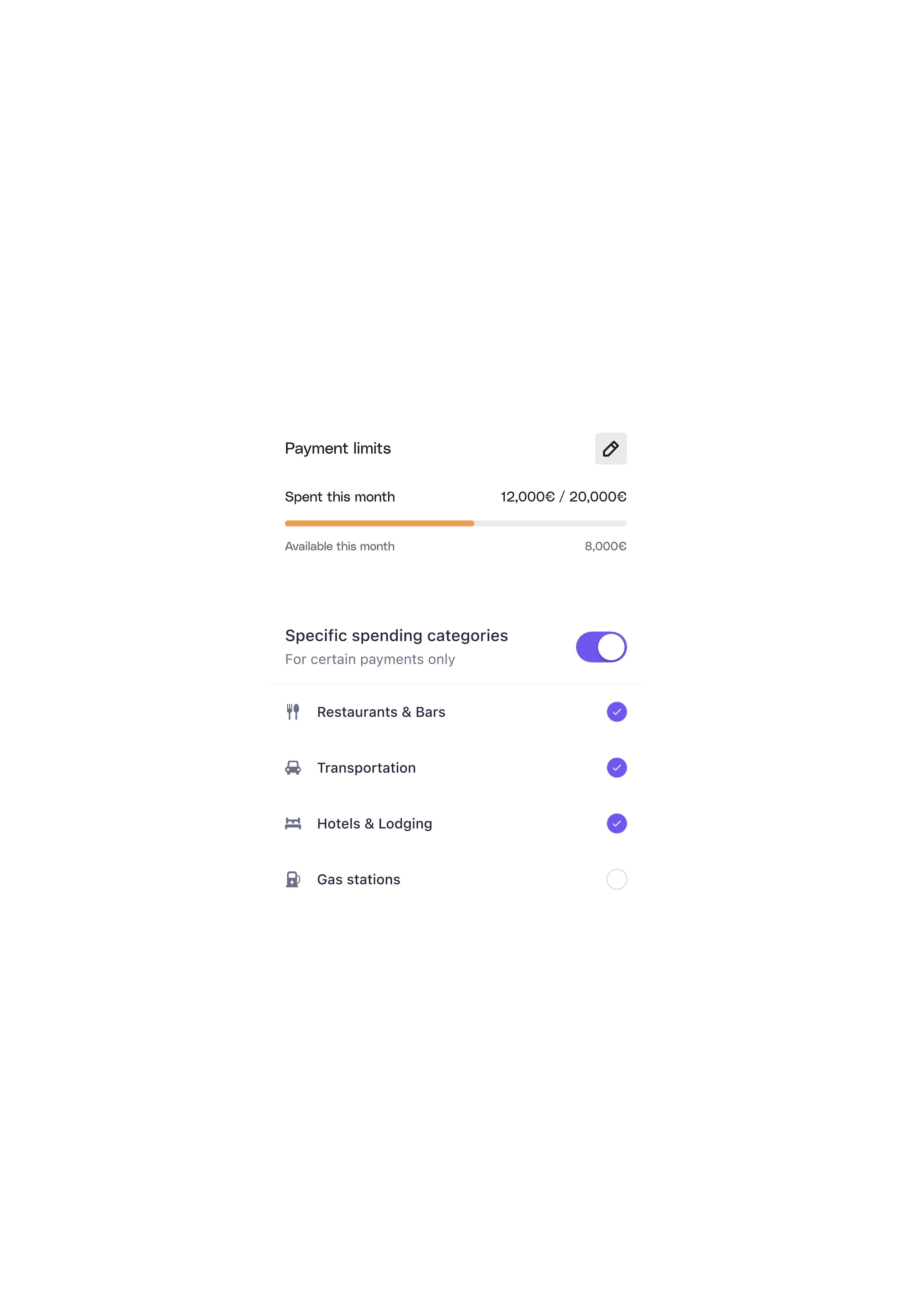
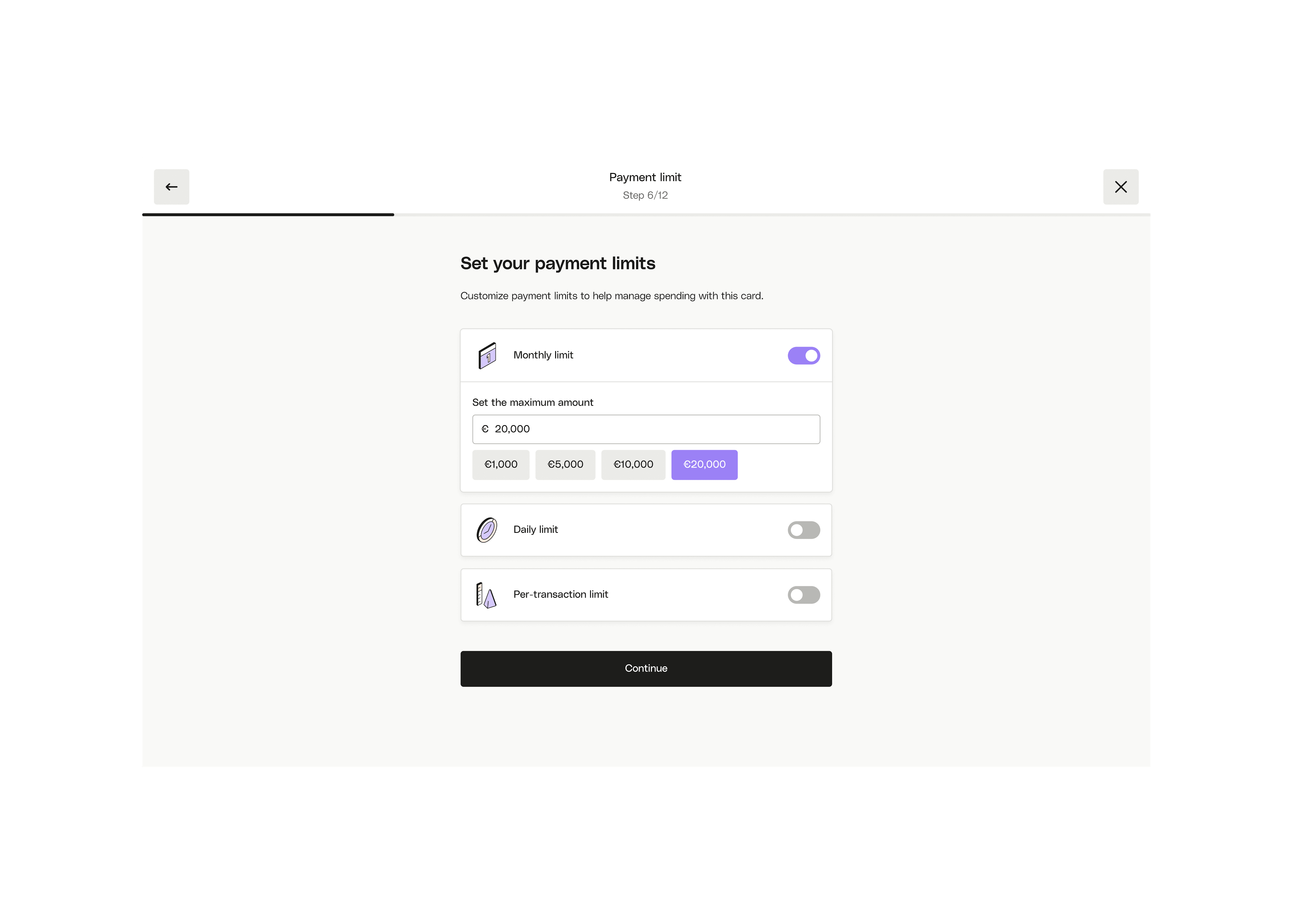
To address trust issues among team managers, we added additional control settings. This included payment limits and spending restrictions based on specific days of the week or expense categories like restaurants, hotels, and transportation.
For companies managing a large number of cards, we revamped the interface to make it more efficient. We optimized the information hierarchy, allowed users to rename cards for easy identification, and improved the process for displaying and copying card numbers during payments.


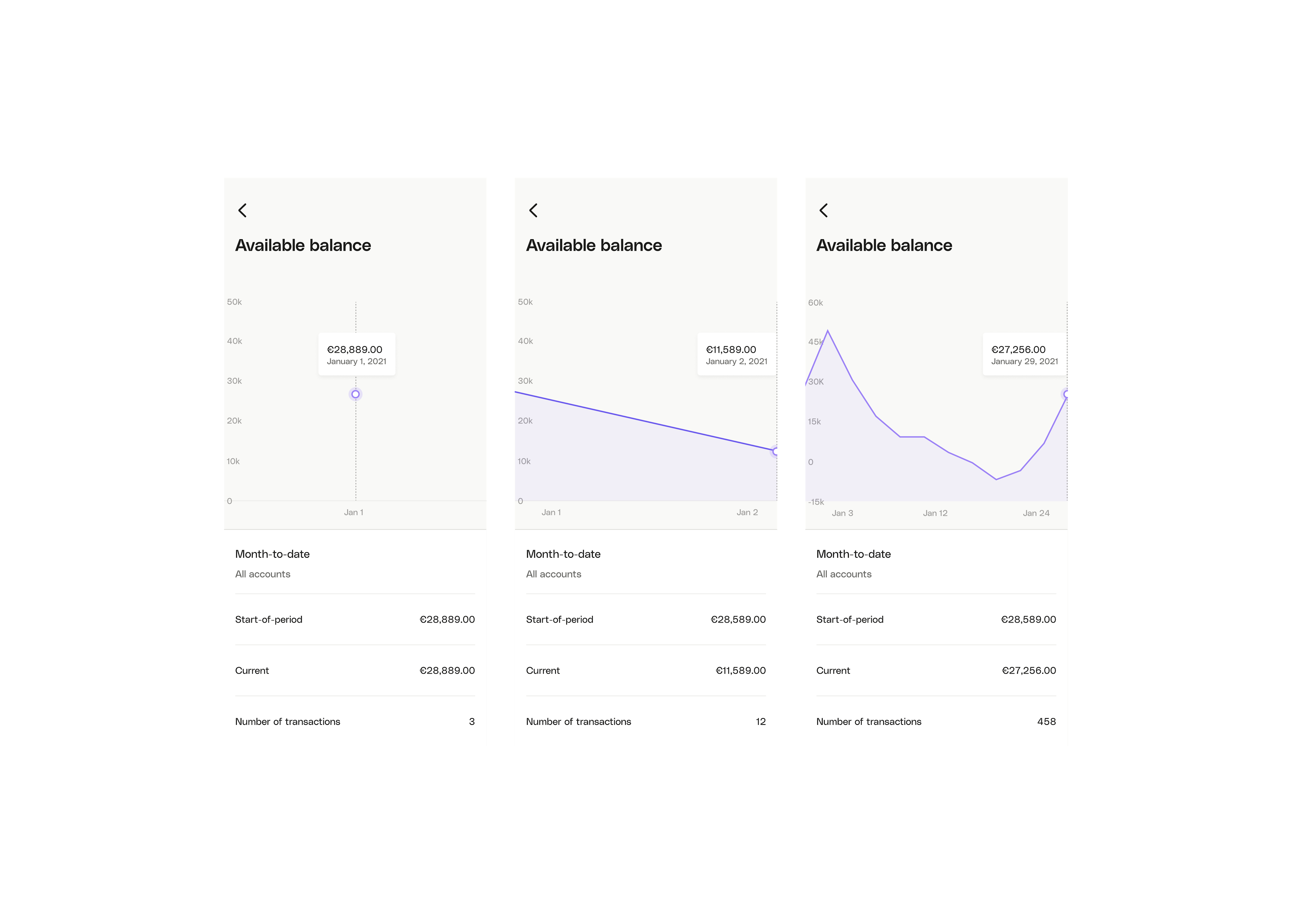
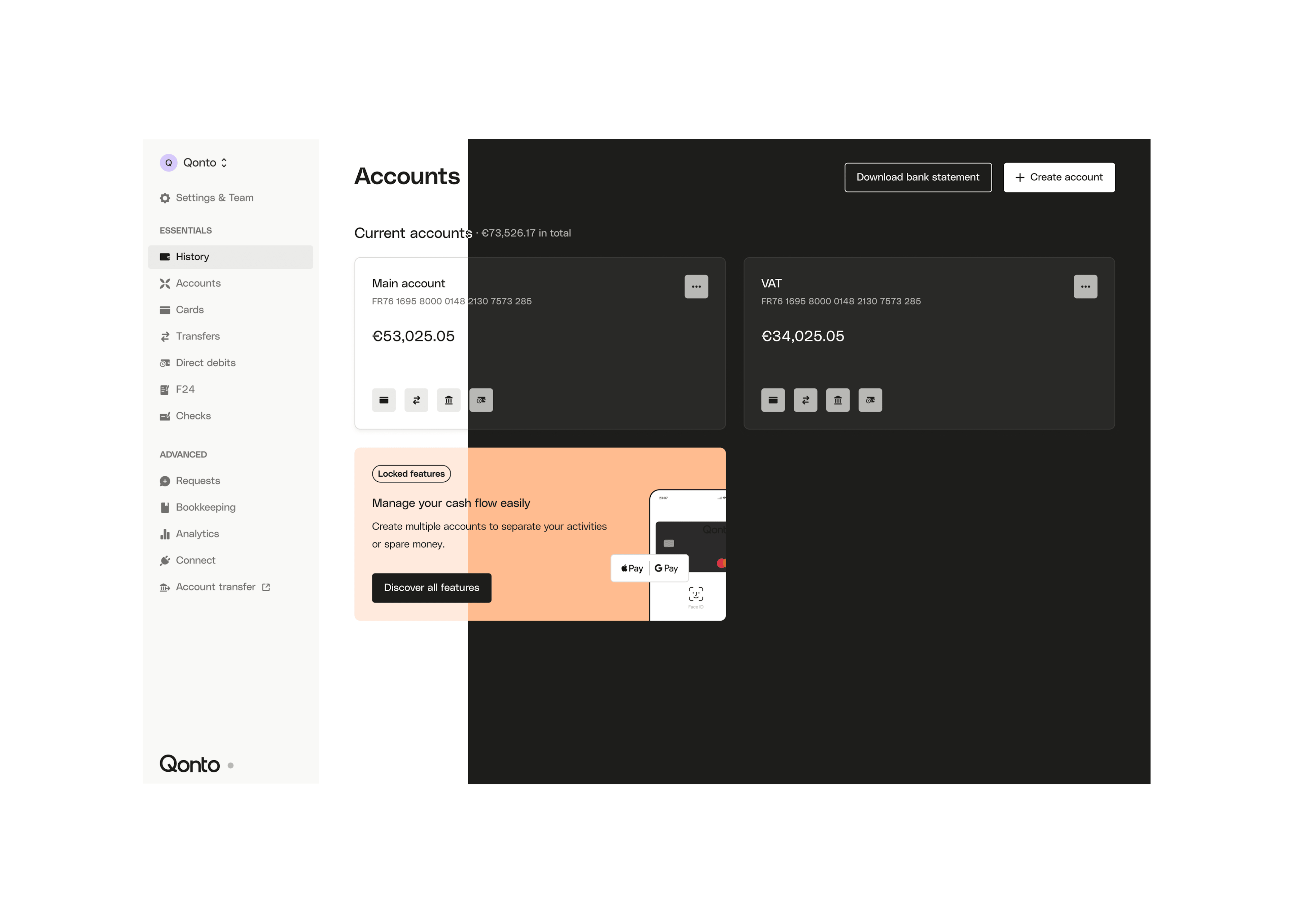
Dashboard
One of the critical aspects that were missing at Qonto was a practical cash flow management function for our clients.
Designing a dashboard for Qonto was essential for centralizing financial information, enhancing user efficiency, and supporting data-driven decision-making. It streamlined interactions by presenting crucial data and tools in one place, fostering user engagement and retention.


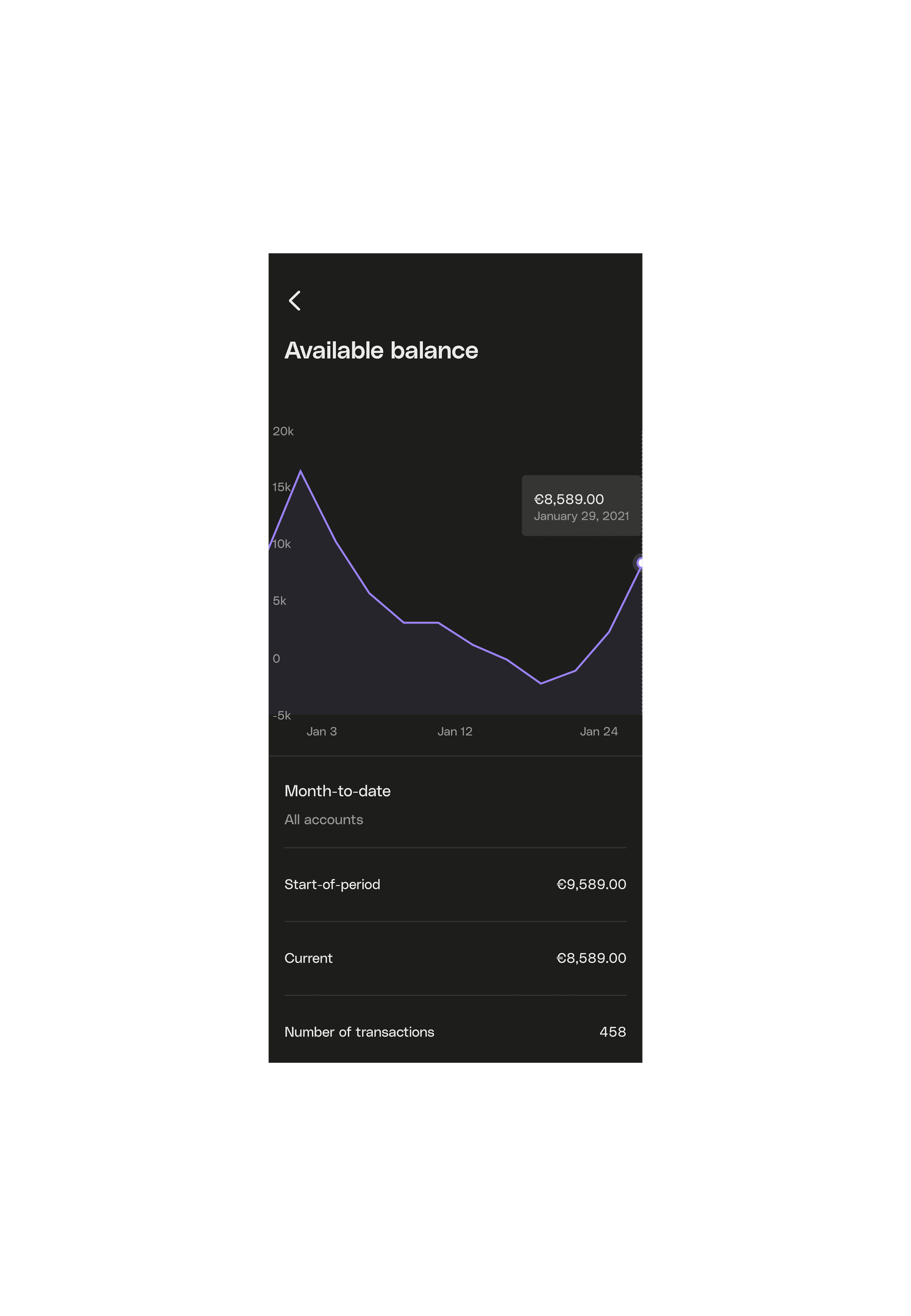
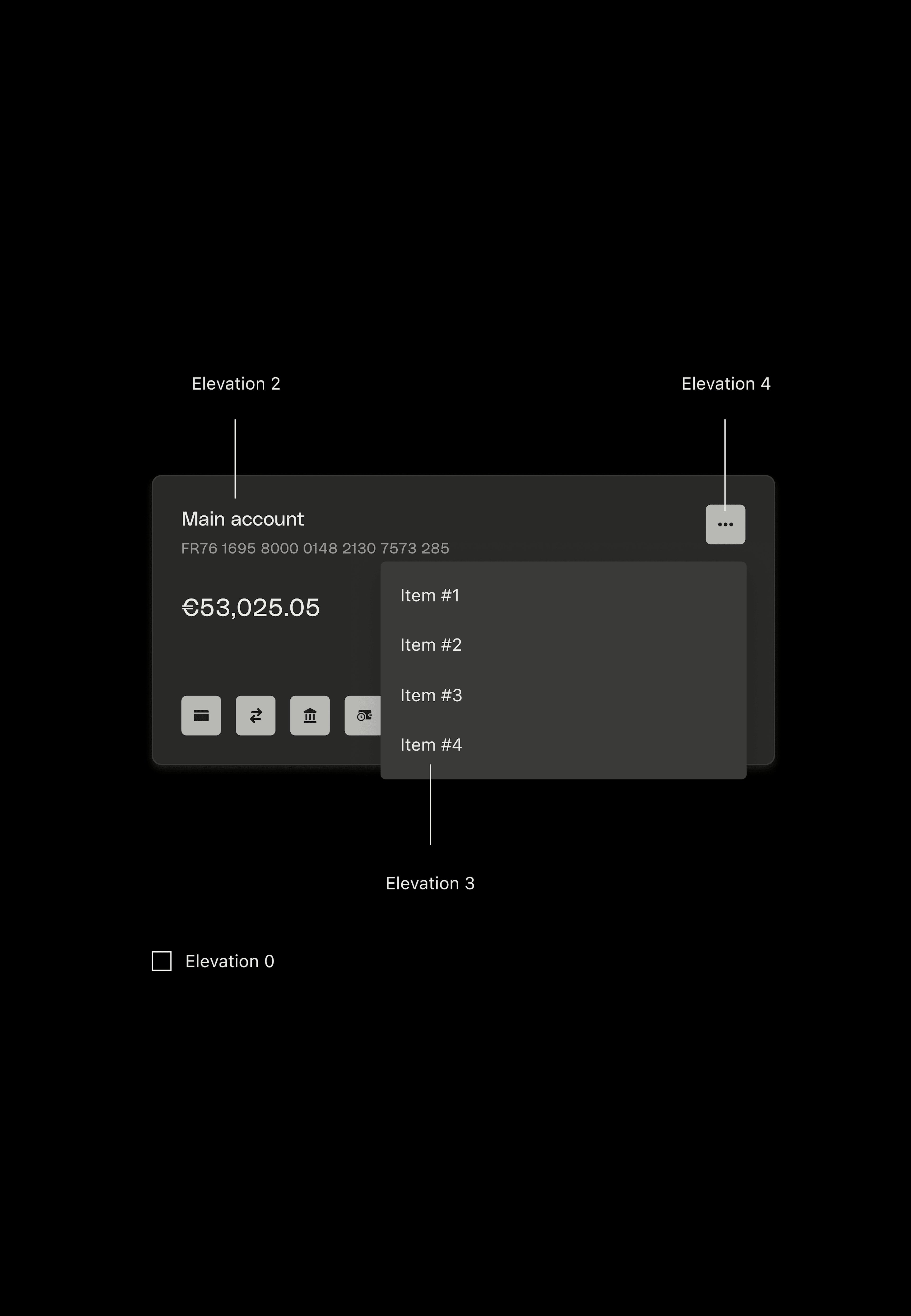
Dark mode
The introduction of a dark theme aimed to make business banking even more appealing and user-friendly. Whether users were conducting transactions before bedtime or checking their account balances late at night, we wanted to provide a simple and enjoyable finance management tool that could be used at any time.
Key considerations for the dark mode design included defining specific elevation levels for various components within Qonto, ensuring that different elevation levels were easily distinguishable from one another.
Moreover, we paid special attention to accessibility by taking into account screen refresh rates, adhering to WCAG's AA standard, and maintaining proper contrast. This approach also involved a comprehensive review of the entire color palette, incorporating lighter tones to enhance readability on surfaces within the dark theme.
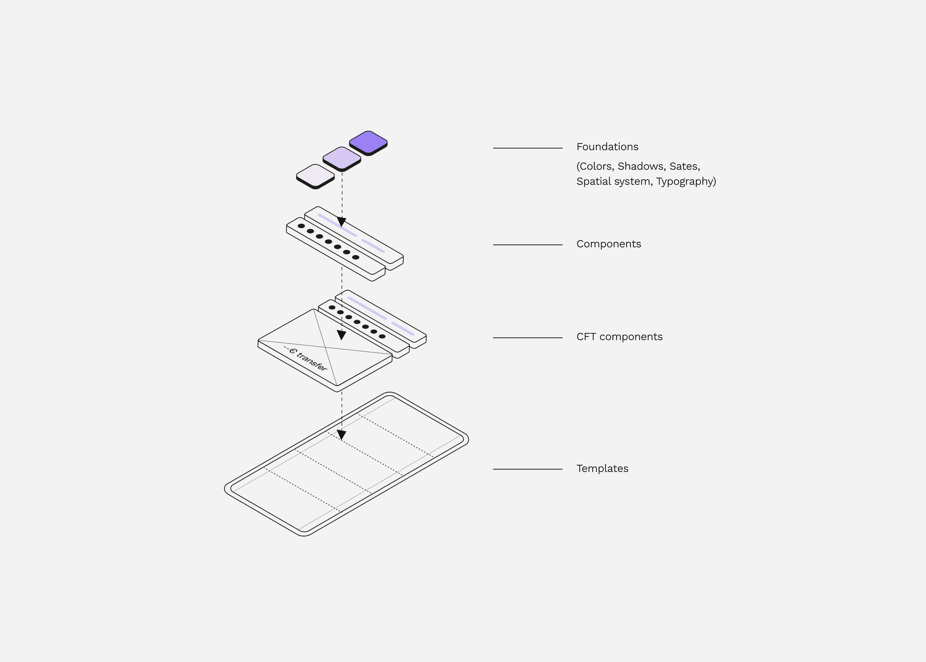
System design
The primary objective was to create a design system that was both reusable and scalable to maintain quality and speed in a rapidly growing environment.
Foundations & Styles: We began by establishing digital brand guidelines, which served as the foundation for building components, patterns, and screens.
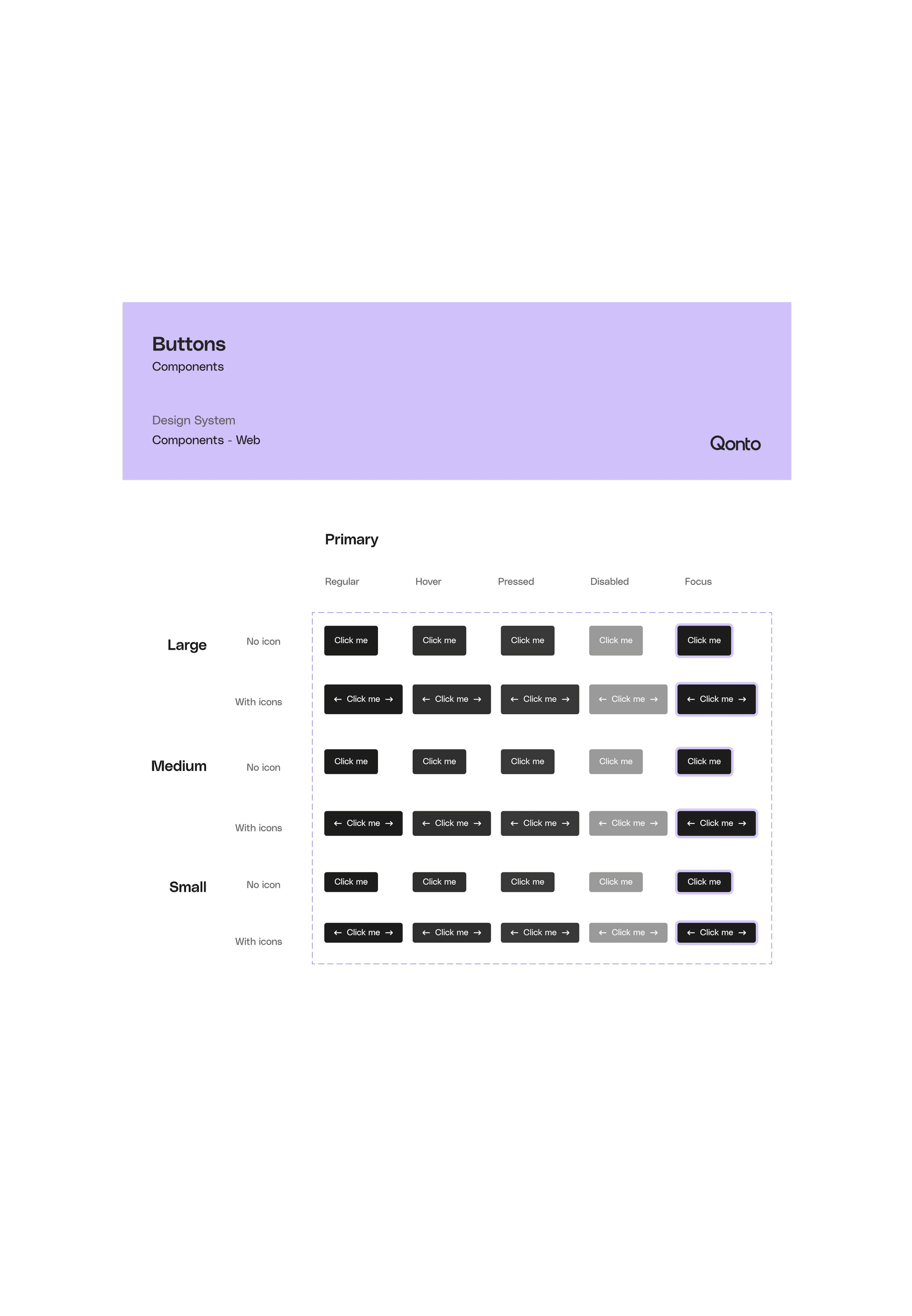
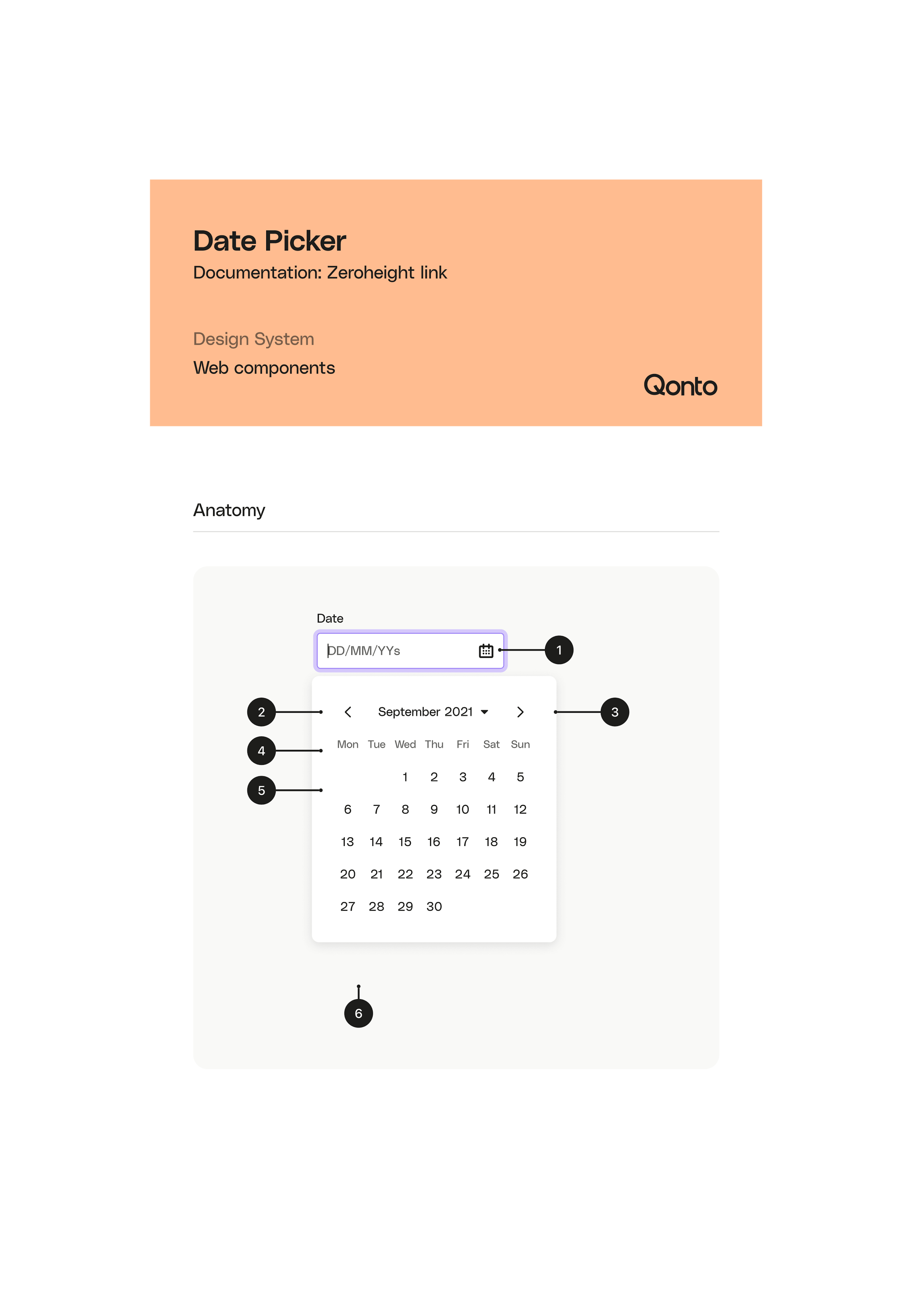
Components: We designed a wide range of reusable and generic building blocks that formed the core of the user interface.
Cross-Functional-Team Components: To enhance efficiency, we created team-specific components, such as those for transfers, that combined frequently used elements from the design system library. This approach allowed different teams to work more effectively while maintaining a unified design language.
Templates: We leveraged these reusable components to create templates for generic screens within the product.
Discover more projects